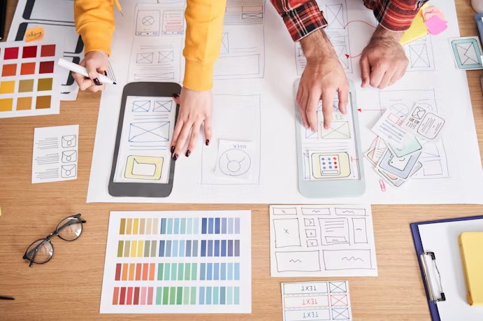
Ever downloaded an app that looked amazing but felt impossible to use? Or one that worked well but looked like it came from 2009? That’s where Mobile App Design comes in. It’s not just about colors and fonts. It’s about making users feel good while using the app and keeping them coming back.
In this blog, you’ll learn what makes a mobile app design great. You’ll also get simple tips to improve user engagement. Let’s dig in.
Mobile App Design That Actually Keeps Users Hooked
Design isn’t just decoration. It’s communication and experience. And when it’s done right, it keeps people interested and active. Let’s break it down.
Keep It Simple and Focused
Clarity Beats Creativity (Most of the Time)
You don’t need spinning icons and endless features. You need a clean layout and clear actions. Think about your home screen. Users should know what to do and where to go in the first three seconds.
Buttons should be visible and easy to tap. Fonts should be readable and consistent. These sound obvious, but get skipped more than you think.
Two Goals Max
Every screen should support only two things. For example, showing a product and helping users buy it. Or displaying updates and letting users respond. Anything more can confuse people and slow them down.
Design for Thumbs, Not Just Eyes
Tap Areas Matter
Most users use one hand and one thumb. Make sure tap areas are big enough. Also, avoid putting buttons too close together. That leads to mistakes and frustration.
A good design thinks about comfort and movement. Can the user scroll and tap without adjusting their grip every time? If yes, you’re on the right track.
Place Key Actions Where They Can Reach
Use the lower half of the screen for common actions like “Next” or “Add to Cart.” The top corners are harder to reach. You want the experience to feel smooth and natural.
Who Are We?
We cater to all your business needs from digital
marketing to website development!

Use Color and Contrast Wisely
Color Isn’t Just Decoration
Use colors to guide users. For example, green for confirmation and red for errors. But don’t go overboard. Pick a few colors and use them consistently.
Also, check your contrast. Text should stand out against the background. If users have to squint or zoom in, they’ll leave.
Accessible Design Wins Every Time
Use enough contrast and readable fonts. Avoid using only color to show differences. Add labels and icons, too. This helps people with visual impairments and just makes your app easier for everyone.
Onboarding That Doesn’t Feel Like Homework
Start With Just Enough
New users don’t want to read a manual. Keep your onboarding short and interactive. Show one or two things at a time. Let users explore at their own pace.
Skip the ten-screen tour. A short welcome, a tooltip or two, and a skip button work better. People want to use your app, not study it.
Let Them Try Before Signing Up
If possible, let users explore the app before asking them to register. That small delay builds trust. Once they see value, they’re more likely to sign up.
Feedback and Animation (But Keep It Snappy)
Tiny Details Make Big Impact
When a button is tapped, it should respond. When an action is done, show a confirmation. Feedback makes people feel in control. It also reduces guesswork.
A simple animation or vibration helps, too. But keep it short. No one wants to wait for a loading screen with fireworks.
Microinteractions Matter
These are tiny responses to user actions, like a heart that fills when tapped or a checklist that ticks off. They make users feel seen. And they make the app feel alive.
Consistency Builds Trust
Make It Feel Familiar
You don’t need to reinvent every button or layout. Stick with what works. Users expect certain things to be in certain places, like a search bar at the top or a back button on the left. If your app looks and feels familiar, people will trust it more.
Also, use the same style across every screen. Fonts, icons, and color patterns should match. A jumpy design makes people feel lost. And no one wants that when they’re just trying to order food or check a message.
Reuse Patterns
Have a successful screen layout? Use it again. Reusing design patterns isn’t lazy. It’s smart. It helps users predict what will happen next. And that lowers frustration and boosts confidence.
Grow Human-Centered
Businesses
Online
Web App Vault is a custom web design and business
website development company that enhances the visibility
and credibility of businesses. We are an approachable
eCommerce service provider that fuels digital marketing.
We Are Here To Help
Web App Vault – Your
Industry-Specific
Data Guardian
Our industry-specific web application solution
provides robust data security and a seamless user
experience tailored to your industry’s requirements.
Safeguard your sensitive data with assurance.
Providing Animation Services To
Clients In Multiple Cities Across USA & Canada
- Arlington
- Cleveland
- Jacksonville
- Miami
- Orlando
- Atlanta
- Dallas
- Louisville
- Minneapolis
- Philadelphia
- Austin
- Denver
- Kansas City
- New York
- Portland
- Chicago
- Houston
- Los Angeles
- New Orleans
- San Diego
Speed and Performance Matter
Fast Apps Win
Design means nothing if your app runs slow. Users will tap away if it takes too long to load. Keep animations short and optimize image sizes. Also, test your app on older devices. Not everyone has the newest phone.
Handle Errors Gracefully
Let’s be honest. Things break sometimes. But how your app responds to a problem matters. Show error messages that make sense. Offer solutions, like “Try Again” or “Check Connection.” A vague “Something went wrong” helps no one.
When your app handles errors well, users trust it more. They also stay longer.
Conclusion: Great Mobile App Design Means Thinking Like a User
In the end, Mobile App Design isn’t about showing off design skills. It’s about making users feel smart, fast, and valued. If your app feels easy and pleasant, users will come back. If not, they’ll delete it without blinking.
So keep your design clean and your actions clear. Prioritize comfort and focus on real-life use. When in doubt, ask this: Would you enjoy using it?
And if you said no? Time to go back to the drawing board.
FAQs
1. What’s the most important rule in mobile app design?
Keep it simple and clear. Users should know what to do and how to do it without guessing.
2. How do I know if my design is working?
Watch how users interact with your app. Use tools like heatmaps and feedback forms. If they stay longer and come back often, that’s a good sign.
3. Should I design for Android and iOS differently?
Yes, but only where it matters. Stick to platform-specific patterns for things like navigation and gestures. Keep the core experience the same.